Font choices have to link in and suit with the layout of the clip and or case, our opening title sequence. The way a word is laid out, can already say if a film is a romantic comedy, action or even horror.
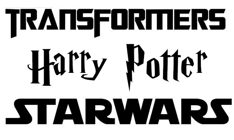
Each of these films are a different genre and their titles already hint on what they represent:
- 'Harry Potter' is a fantasy and the way each letter is designed and kind of floating in air shows the playful and magical journey the films represent.
- 'Star wars' is science fiction and fantasy, which would explain why letters are bold and also sans serif; this suggests a futuristic type of film (which Star Wars is).
- 'Transformers' is science fiction film but also a thriller. The letters aren't painted but like a machine put down for the title, typed in secure and bold just like machinery used in the films which are called Transformers.
Our idea was to have the font looking as similar as possible to our trailer, so it'd look sinister, secretive and of course would make the audience believe the genre is horror.
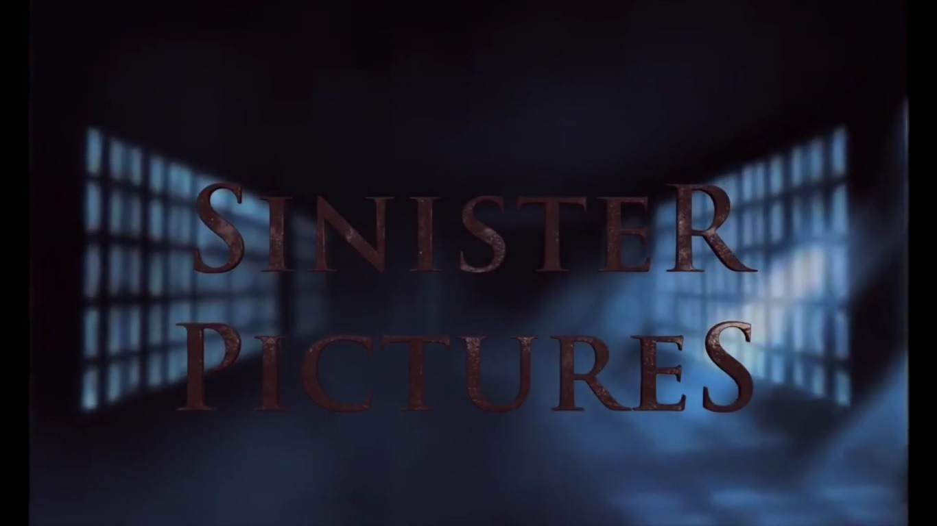
The idea of a metal font that looks rusty and represents blood shows the negativity in the font. This shows a general horror aspect in our Production Company logo; the serif typeface also conveys a feeling of suspense and mystery. This is why we decided this was our Production logo chosen font.
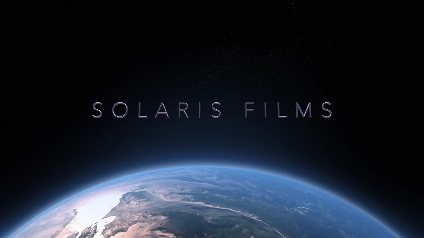
A solid thin metal effect font for our Distribution Company (called 'Solaris films') shows more fact based information; this is present within the logo. For the audience it doesn't represent horror and that was what we were aiming for.
