In order to create a successful project, we need to ensure that there is a main theme throughout our work, something with significance that the audience would be able to identify as part of our franchise. This increases the chances of our audience having a lasting memory of our products and makes the franchise stand out from competition. Iconic or symbolic imagery can expand on the overall popularity and can draw in more profit from the film as it is a recognisable franchise which the audience will already be familiar with.
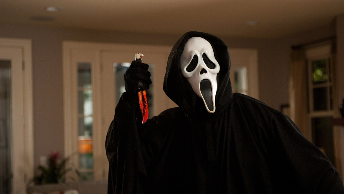
Iconic Images - Scream
|
Scream was released in 1996 and the use of the mask quickly became one of the most iconic images of all time within that horror film industry, the specific mask can be instantly recognised as the antagonist from the Scream franchise. It become a powerful promotional tool and was used to promote the sequels which followed. Having an iconic image is a vital element of a successful, recognisable and long-lasting franchise.
|
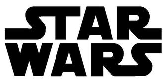
Iconic Texts - Star Wars
|
The font used for the Star Wars logo is iconic due to the huge popularity of the films. The simple yet effective design also allowed people to easily identify it, allowing the design to become ingrained into the minds of both fans and non-fans alike. The font is partly why the Star Wars franchise is so recognisable; we wanted to replicate this with the font used in our logo.
|
|
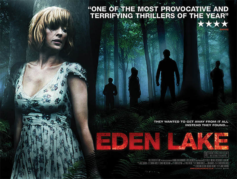
Iconic Posters - Eden Lake
|
For our film poster we chose to take inspiration from the promotional poster for Eden Lake. This formed the base idea behind our movie poster, as the vulnerable woman hiding from a dark and mysterious figure appealed to us and related well to our trailer's theme. The woman in the Eden Lake poster bears some similarities to our main character, which helped it to appeal to us more and provided more inspiration for our own poster.We liked how only the main character was lit, with simple silhouettes in the background, this use of composition makes the film instantly recognisable.
|
Original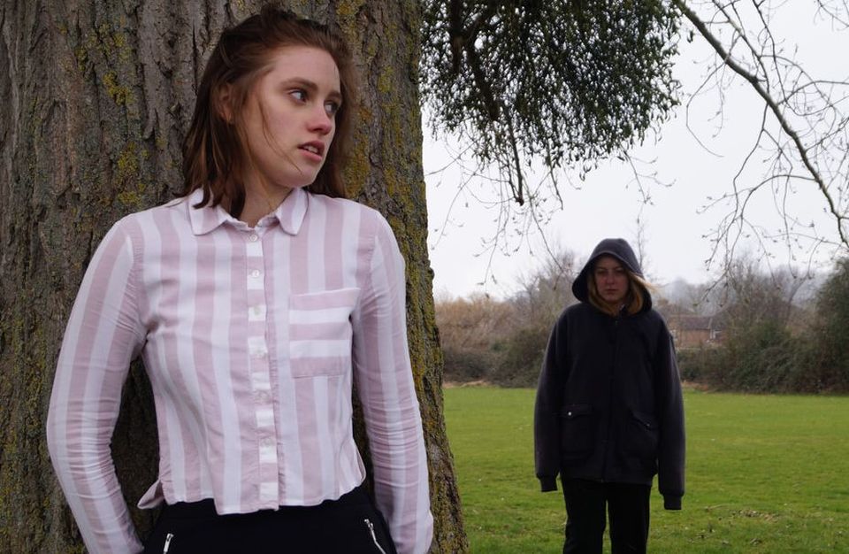
The original image we used was taken during the daytime so that we would be able to see all the detail within the photograph, editing what we wanted to be shown in more detail in the post production process. We kept the image in two distinct halves; the left side with the protagonist and the right side with the antagonist. This helps to distinguish the two apart and helps create a dynamic between them. We also made Jess wear black so that she would be easier to blend into the background during editing once we made the image darker in Photoshop, to make the overall process simpler.
|
Final Film Poster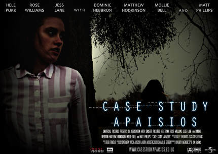
In order to make our poster look as authentic as possible, we changed multiple aspects of the original image. We darkened the image as a whole, edited the contrast a little, and added the relevant text to make it professional looking. We also changed the brightness within different areas of the poster by adding spotlights; namely lightening the area around Hele to properly display the protagonist and antagonist characters. This helps it to relate more to our inspiration of Eden Lake, which ultimately resulted in an atmospheric themed poster.
|
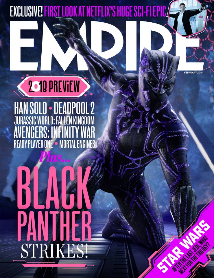
Iconic Magazines - Empire
|
Empire is a magazine that primarily centres on film for the majority of its content. It regularly covers a variety of different genres of film, and has occasionally featured horror films on their front covers. We wanted to emulate the style of Empire's magazine covers with our own cover, so we created a version that takes the typical style and layout of Empire magazines and put our own twist on it. This includes the stylised fonts used, the colour schemes (in this case matching the purple of the image with the pinks and purples in the text), and the overall layout of the various elements. The main title of the magazine typically has sections of it hidden behind the main image, which again is one of Empire magazine's key features. This can also expand to the puffs (as with the top right puff in this example). This is what has helped Empire magazine to be iconic; the image jumping out from the cover and masthead has become an aesthetic feature of every Empire magazine that we aimed to replicate. |
Original |
Final Magazine Cover |
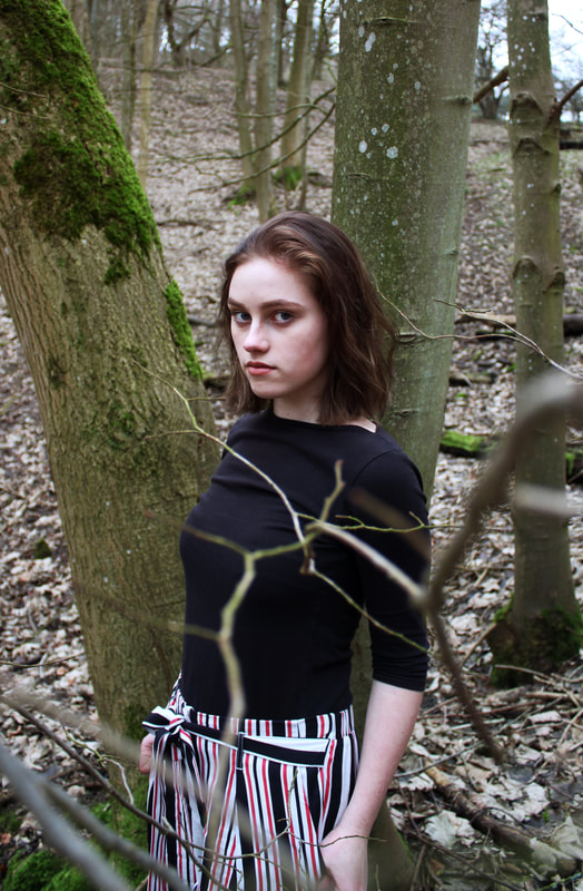
The original image we used was taken during the daytime so that we would be able to see all the detail within the photograph, editing what we wanted to be shown in more detail in the post production process. We made Hele wear black so that she would match the horror theming of the film, as well as make her wear striped trousers to fit with the branding identity's striped details. Red stood out to be the strongest element of colour within the picture, so we went on to see how we could play with the colour in post-production.
|
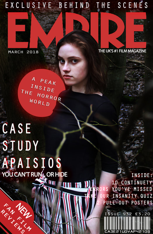
In order to make our magazine cover look as authentic as possible, we changed multiple aspects of the original image. We darkened the image as a whole, edited the contrast a little, and added the relevant text to make it professional looking. We also changed the brightness within different areas of the poster by adding spotlights; namely lightening the area around Hele to help her stand out in the centre of the cover. The use of the Empire logo and the way Hele's image overlaps with it is iconic of that magazine, which helped our version to seem more like the real thing. We made the colour red the main theme of this magazine cover, it made the red stripes on her trousers stand out and made our branding stronger.
|
