Types of Magazine Cover
There are a total of four different types of magazine cover; each of which has different effects on the reader. They are all designed to entice a potential customer into purchasing the magazine.
Actor
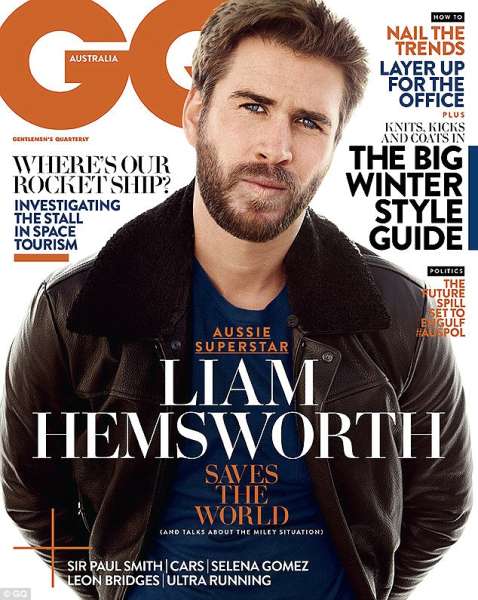
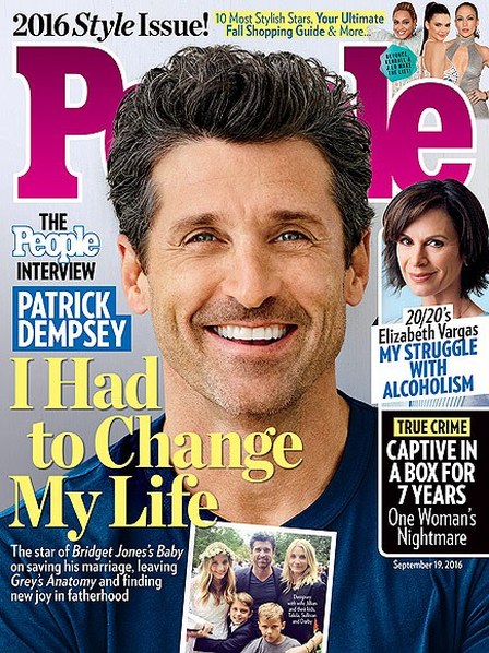
This type of magazine cover consists usually of an actor's head in the centre of the page. The person featured is most likely dressed in their everyday clothing and not as the character from the film. This entices the person in as they may have an interest in the actor/actress featured on the cover and not especially the actual film they are featured in; they buy the magazine based upon their interest in the person and not the film.
|
|
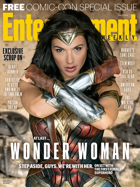
Action Shot
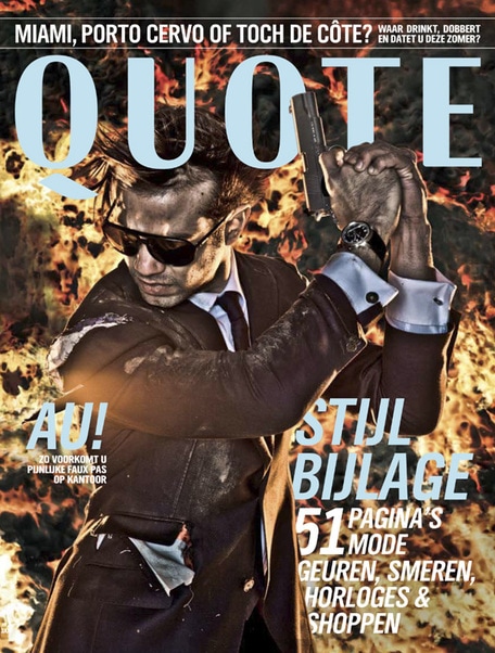
This type of magazine cover features a shot of an actor/ actress in their characterised form, performing some sort of action (i.e. a punch, etc.). This makes the person viewing the magazine question themselves and think about what exactly happened for the action to take place; what set off the action. This in turn makes them buy the magazine as the action may have something to do with the film the character is featured in; sparking their interest.
|
|
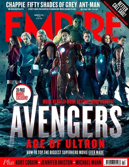
Character
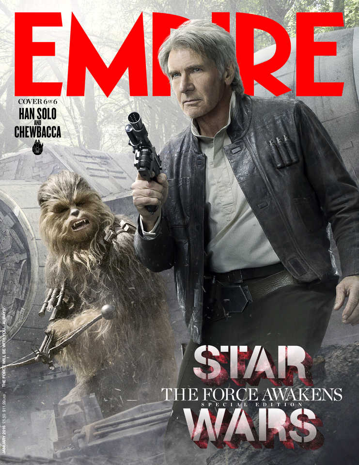
This is a basic type of magazine cover that features the prominent character(s) from a particular film. This attracts the viewer as it features the main character(s) and sometimes the setting of the majority of the film; getting potential fans of the film hyped up as the magazine could give potential crucial details of the film; enticing the person to buy the magazine.
|
|
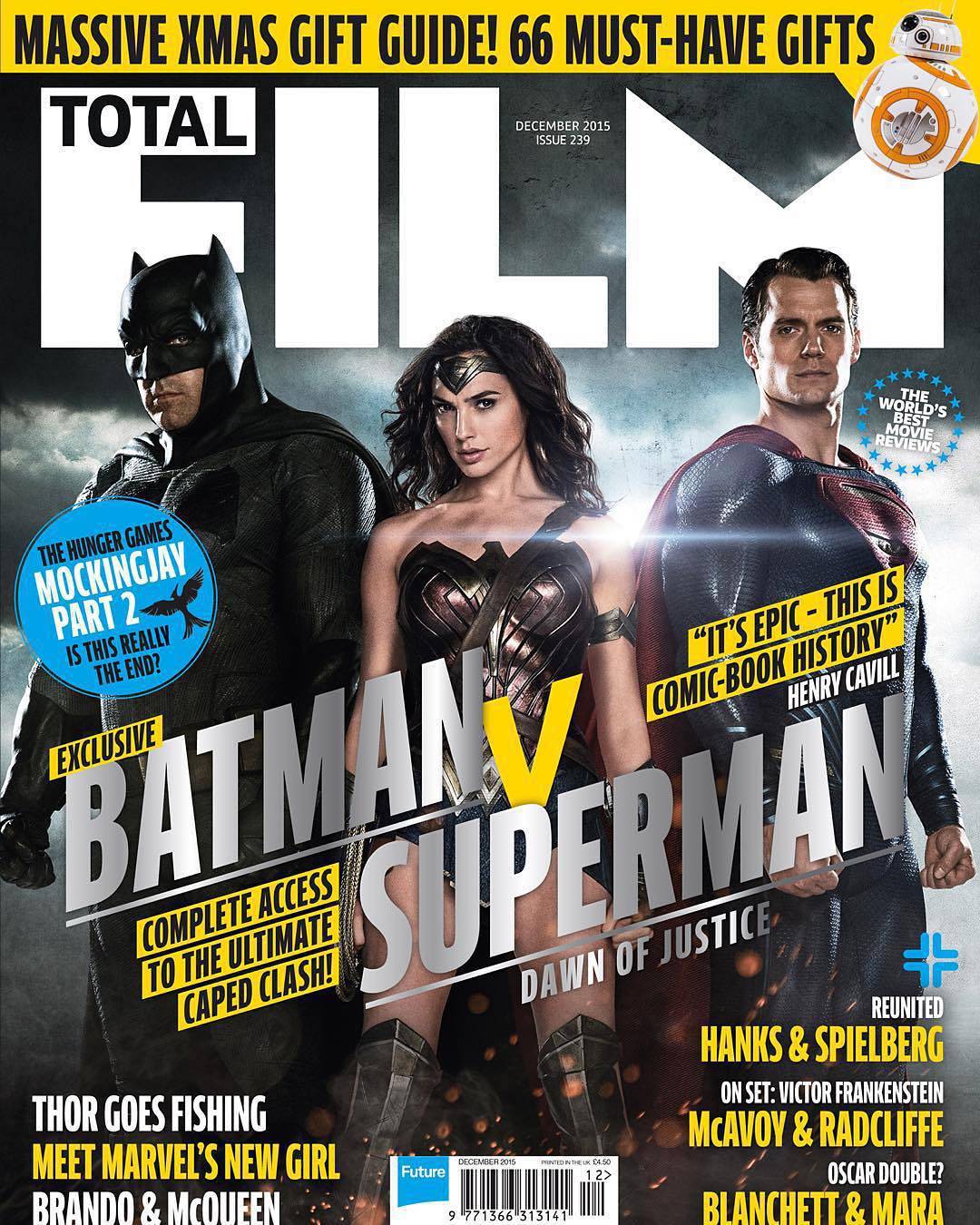
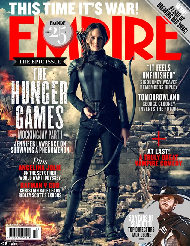
Staged Action Shot
This type of magazine cover features a staged shot of prominent characters in the film featured. This is usually also used in other promotional material (e.g. posters, advertising, etc.) and has multiple characters stood facing the camera in a fairly dramatic shot.
|
|
Magazine Cover Analysis
|
Top Section
Middle Section
Lower Section
|
|
Horror Magazine Examples
|
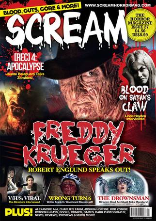
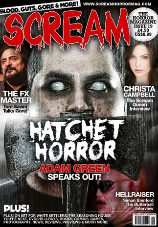
The horror magazine Scream uses the aforementioned different magazine cover elements to help engage the potential reader. They use a unique house style in the masthead to make the title of the magazine stand out, which uses different colours based on the colours of the rest of the magazine cover. The examples use white and red primarily, but changes the use of them to stand out against each other. One uses a white title against a mostly red background, whilst the other inverts this. Both instances help to make the overall cover stand out by contrasting the title with the rest of the cover, appealing to the viewer. A common theme with every issue of the magazine is the skyline; it has the subtitle "Blood, Guts, Gore & More!" to further emphasise the theming of the magazine. It also helps to establish the magazine as a brand, as the skyline and masthead are unique enough to engrain it into the reader's mind and help them to spot future issues and buy them. The main image of both examples uses a close up of a horror character; this lets the reader know what the main article of the issue is. It is usually either related to a new film that is recently or about to be released, or of a more generic character that relates to an article of a specific theme (such as the "Hatchet Horror" in the second cover). These images almost always have the character looking directly at the viewer (direct address) to provide a more interesting cover that draws in the viewer. Plugs and cover lines are used frequently in both covers, primarily in the centre of the cover for the main article. Each plug in the centre is written in the second largest font on the page (aside from the masthead), which is done to make sure the viewer's eye is drawn to the article subject. Secondary plugs and cover lines are then placed around the edge of the cover, which draws the viewer from the main article outwards and having to look over the whole cover once they have become interested in the main plug. These secondary plugs and cover lines are of less popular or well known films, which is used to advertise the variety the magazine features. All the cover lines are relatively small compared to the rest of the text, and is very brief to not spoil too much about the article and interest the reader more, making them purchase it. A flash is used on every issue to advertise the price of the magazine, its issue and the fact that it is "The Horror Magazine", which further makes the reader interested in the magazine. The flashes are placed in a circle to help it to stand out to the reader; it contrasts with the rest of the style of the magazine cover. At the bottom of the cover, a different kind of plug is used to advertise the smaller amounts of content in the magazine, which contains generic things that carry over to each issue (such as DVDs, books, photography, etc.) as well as a couple of unique things that aren't as important as the main plugs and cover lines are.
|
