Trailer analysis: Case Study Apaisios
USING CONVENTIONS IN OUR TRAILER:
DEVELOPING CONVENTIONS IN OUR TRAILER:
CHALLENGING CONVENTIONS IN OUR TRAILER:
- Our most important convention is fast pace which starts calmly and builds up for tension. This will keep the audience hooked and interested until the very beginning. Our inspiration wasn't based on a specific trailer but good examples are "The Open House" or "A Quiet Place"
- We've also used a distressed phone call as our narrative. At first we tried add more dialogue within our trailer but it took away from the mystery of Black Eyed children which led us to believe that having a caller explaining their situation would work better. This also helps to link our trailer with the actual storyline as it's based on a detective trying to solve the "Black Eyed Kids"-case. This means both the call heard is from the police station as well as where the forces solving this case are working. Our biggest inspiration came from "Don't Hang Up".
- In our trailer, the detective is a stereotypical blonde female who usually in films is the weakest link but in our trailer she's meant to represent the contrasting difference of a strong well-accomplished leader who goes to work on the "case" which involves strange children with black eyes. To the audience it's meant to seem like she doesn't want to believe the supernatural side of the story until later on in the trailer. This leads her getting too involved and facing the creature herself. The trailer doesn't revile the outcome of the attack so it's on the interpretation of the audience member.
DEVELOPING CONVENTIONS IN OUR TRAILER:
- Our storyline is kept linear so it wouldn't get too over complicated as our actual trailer has a difficult plot. This also helps the audience to follow our trailer without getting bored. We got our inspirations from "The Conjuring" and "Ouija: Origin of Evil".
- One of our challenging conventions is having multiple victims what we thought could take a bit of attention from the main characters. Our trailer focuses on the main character and every audience member is able to tell that when watching our trailer. Showing more than one victim gave us the chance to bring out how this occurring problem is relevant to everyone and not just the detective as he gets involved in the case. This was also to mess around with our linear storyline because as a detective some of the murders happen in the past. This is similar to "The Ring".
CHALLENGING CONVENTIONS IN OUR TRAILER:
- Another convention is that we decided on having multiple killers or at least the idea of that. Our trailer features one actual killer that the audience sees yet there are more black-eyed kids seen in the trailer just not witnessing them actually committing a murder. This idea got based on "Sinister". This creates a secretive situation where the audience will be left questioning who is the actual evil origin.
- We decided to have the main elements be based around movements rather than dialogue which means we have used minimal dialogue. This is a dangerous decision as it could work well or go horribly wrong. The idea is taken from "Hush" where the characters don't have many vocal interactions yet the concept makes the trailer and film interesting. This is a popular idea at the present time and also features in "A Quiet Place" and "Don't Breathe". These inspirational trailers, create the idea of not being able to speak or you might die and as our killer's a child and mostly hides themselves throughout the trailer so it could be counted that they hunt not just by visual but also by sound.
- Our decision was to include both genders to be the killers. Our trailer only features 2 killers but overall they're referred to as children so both genders are involved with the same similarities of a killer. This gave us the ability to show equality in the killer category between both genders as well as we've done so in the victim/non-power characters. We show equal amount of victims both the detective as well as a general victim who gets taken from they're walk home. We got our inspirations from "Saw" and "Insidious" where the characters experience deaths from men and women. Even if the characters aren't counted as the main killers, they still play an important part when it comes to the overall idea of genders and casting decisions in horror films. For example, women aren't just victims, they could play the role of the killer as well as male roles do.
Movie Poster
|
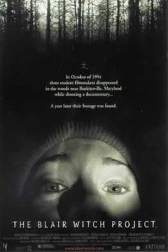
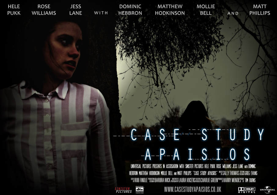
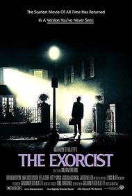
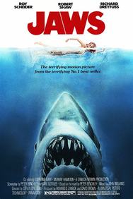
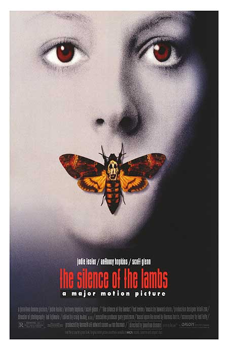
When creating our poster we decided to focus on playing with shadows as our killer is placed in the background and hidden from the detective. Overall we placed everything within the dark colour scheme. This was done to create a mystery effect which links with black-eyed children as they're a mystery to human kind. Posters are usually divided into 2 types-colourful or black and white. We fused 2 ideas together. Our poster is in the middle grounds as it has slight green showing with fair amount of other colours but thanks to the dark colour scheme, everything seems almost grey. This is similar to 'Eden Lake' and 'The Exorcist'. Compared to other posters like "Jaws" or "Silence of The Lambs" who've used a lot lighter colour schemes and played around with the details more than the dark horror theme. We've clearly got more inspiration from the darker themes as it suited our trailer better.
|
|
|
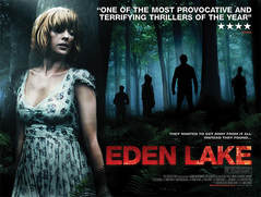
For our image positioning we wanted our image to have the detective being hunted by the main black-eyed child. We decided to have the child in the shadows on the background which leads the audience in doubt because they might not notice them straight away. The picture is placed outside with trees because the final scene is based with the killer chasing the detective in the woods so the poster links to the trailer. Also having the poster based outside, the wind helped us with keeping the killer's motif alive as the wind blows their hair and gives sense of them being alive, hunting and not giving up. This is similar to our biggest influence "Eden Lake".
One of the main themes that takes place on each of the pictures and in the trailer as well, is the use of morse code which links to the narrative phone call. We haven't just added written morse code on the poster but also linked the idea of stripes in the code and both the magazine cover and movie poster, the main character is wearing stripes to connect the deeper meanings. Also in our trailer, we've added morse code sound to influence the visual effects. Overall we've linked all production items with different morse code patterns with both visual and sound choices. Our poster has a tagline of 'You can't run or hide' which is also features in the trailer. On the poster it's brought out through morse code to bring a secretive atmosphere.
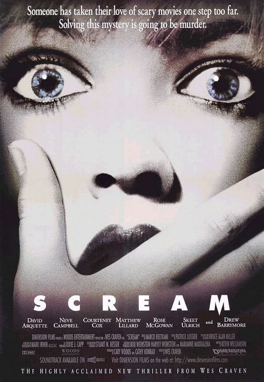
For the font on our poster, we decided to have a simple readable text with dots and lines going through the letters which represent our tagline "You can't run or hide" in morse code. The text has also a little blue shadow line behind the letters which differentiates the text from the background and brings it more to the front. Letters were put into a bigger spacing giving the effect of isolation and loneliness. Our poster text is similar to "Shrooms" and "Scream".
For the font on our poster, we decided to have a simple readable text with dots and lines going through the letters which represent our tagline "You can't run or hide" in morse code. The text has also a little blue shadow line behind the letters which differentiates the text from the background and brings it more to the front. Letters were put into a bigger spacing giving the effect of isolation and loneliness. Our poster text is similar to "Shrooms" and "Scream".
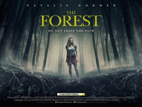
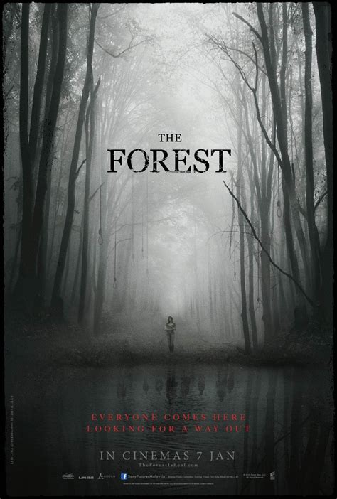
We decided to keep our poster landscape because that way we could bring our both the detective and the killer while they're in an action shot almost like it's a scene taken out from the trailer. This gave us the ability to have both characters stood up whilst the detective leans against a tree. For the audience this gives a sense of an open outside region where there's not a lot of places to hide. A similar poster idea was taken from "Eden Lake" or "The Forest". Both posters feature a forest or an important tree where the nature idea links with ours. Those were our main inspirations. Also having the poster landscape, gave us the chance to use a different title which brought the element of our sinister trailer.
|
|
|
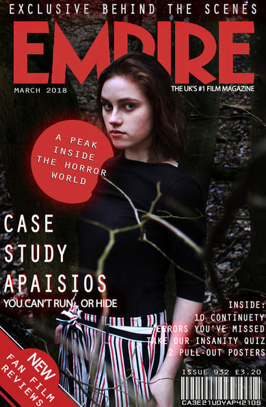
Magazine Cover
|
For our magazine cover, we decided to use a picture of the main character in woodland setting where she'd be against a tree. This was done to bring out the idea of having nowhere to hide as the woods are wide but also open. The final chase in our trailer also happens in the woods so this picture was chosen to link with that general idea. For the audience it's meant to create an intense feeling as the actor's looking straight into the camera and looks concentrated. We got our inspirations for this positioning pose from "Hannibal" and "Maniac" where the actors create intense eye contact in order to make their audience interested in the magazine's content.
For the font for our magazine we chose the text to be similar with our trailer as well as making sure it has similarities with the usual magazine font choices to make it look professional. Magazine's main title-"Empire" is in red which led us to use white text with some red glowing effects behind it. This gives a more horror film effect as well as brings out the white alone. We decided to use white text because our magazine cover picture itself is quite dark and sinister. This is similar to most magazines that use a darker colour scheme for the background of their magazine. With lighter text, they make it easier to read. We based our main title of our trailer to the right-hand side of the magazine cover so it's is seen entirely but the character would be more in focus rather than the title itself. It's done so the audience would get dragged into wanting to watch the trailer rather knowing the title but not remembering it. The main 'Empire' text is also slightly hidden behind the featured person almost bringing out that they're invincible and judgemental as well which is why her presence is intimidating and important for a horror film. We placed the rest of the words and phrases around the sides but one important sentence is placed just peeking out from the characters back and it says "A peak inside the horror world" so the text links with the positioning. Another way we linked the text with the magazine cover is where it says "Exclusive behind the scenes" as it's placed at the top and could be counted as behind the rest of the text. |
|
We tried to still follow the conventional horror magazine cover using the original 'Empire' text which is around the size of 40 and the next biggest text obviously being the title of our trailer 'Case Study Apaisios'. It was the round of importance that those were based upon. Considering that a poster would be an A3 size, it was important that no text would be too small as in unreadable.
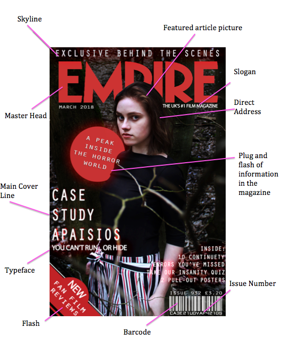
Magazine Cover Explained:
Posters we got inspiration from:

|
|