A movie poster is designed to pique the interest of the viewer to tempt them into watching the advertised movie. To do this the poster uses a variety of techniques to entice the viewer. This includes things like colours, positioning of key elements, typeface and more.
Movie Poster Analysis
|
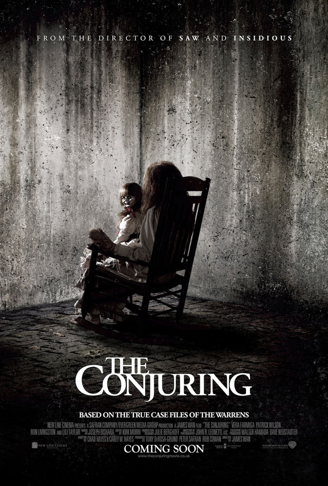
The Conjuring's movie poster features one of the main antagonists and a victim who then becomes a host for another antagonist. The monochromic colour scheme gives a sense of mystery; an eerie cloud of mystery surrounds the whole poster. The only light source is shone upon the puppet, who is the main antagonist of the film and uses the little girl as a vessel for the puppet's evil doings. The light being mainly on the puppet displays the importance of it within the film; clearly telling the viewer that the puppet is a key plot point. However, the light is also on the girl, which shows that she is also important to the film as she is the one possessed by the puppet; hence the more emphasis on the puppet in the poster rather than the girl.
|
|
|
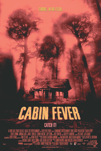
The movie Poster for the film Cabin Fever is very effective due to its limited colour scheme that consists of only black, red and a deep yellow. The red and black contrast with each other very well so you notice the key features of the poster. This most notably includes the titular cabin and the skull shape hidden within the scenery of the treetops and cabin. The skull immediately suggests the theme of death; the black on red also enforces this idea. The poster does not give any hint as to the plot of the film; it only gives us the setting and the rest is a mystery. The relative emptiness of the poster's setting also shows the element of loneliness that is present within the film; inducing a sense of mystery. The caption "Catch It!" references the fever theme of the film whilst also working as a slogan telling the viewer to watch the film.
|
|
|
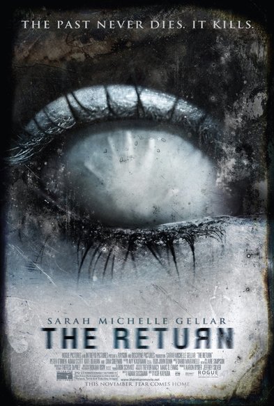
The movie poster for the film The Return has a simple premise, but with complex details. For example, the eye takes up a large proportion of the page, but the hand print is not very visible and gives it a very sinister feel. The white eyeball also gives the impression of with possession; indicating the theme of the film. This is further shown with the hand in the eye; it acts as the pupil, suggesting the possession theme, and is spread out to indicate the possessed person trying to escape their possession. The tagline "The past never dies. It kills" gives the impression of resurrection, which could also link to the aforementioned possession element. As well as this, the name of the movie "The Return" has a slightly blurred text to give the impression of not knowing what the film is about, which emphasises the previous elements more to the viewer. By using the backwards R in the title, it gives yet another implication of mystery whilst also making the title's design link to the theming of "The Return" (i.e. the second R is returning; it is flipped around).
|
|
|
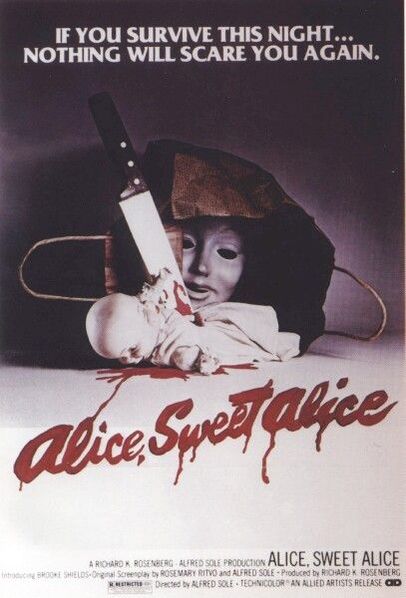
The movie poster for the film Alice, Sweet Alice shows two juxtaposed ideas fitted together. For example to adjective "sweet" does not fit with the contrast of the title being written in blood. It is also a simple yet complex structure, but does not restrict it's target audience, meaning it could appeal to many who are interested in horror. It is not a busy poster, but has a meaningful image. However is complex as it shows a face mask coming out of a bag, leaving us confused yet interested. The tagline "If you survive this night...nothing will scare you again" gives a feeling of the unknown, and temps people to view the film.
|
|
